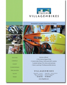
When creating an ad, you’ll want to make sure you accomplish several things to ensure your ad is effective. You have to make yourself stand out among the hundreds, if not thousands, of messages a reader sees every day. There are two key points:
VISUAL AESTHETIC
• You’ll need to grab the reader’s attention by having a visually attractive ad (see previous post “White Space Is Your Friend”). Most of the time this includes an eye-catching or unusual image. Hire a good designer to handle the design for you. Please do not attempt to design your own ad in Word or Publisher. Please.
CONTENT
• A strong headline (perhaps something clever, funny, or emotional). Keep it short, nothing loses a reader like a run-on sentence. Use unique adjectives and verbs that will create a visual picture in someone’s mind.
• When writing the copy, make sure the text is relevant to them. In other words, the text shouldn’t be all about your company, but what your company can do for them – how does your product or service change their world? Keep text to a minimum – a paragraph or two of tight, well-written copy. If this isn’t your forté, you may need to hire a copywriter.
• Your logo should be at the top or the bottom. Not too large, not too small.
• Your contact information and website address should be at the bottom of your ad, that’s where the reader looks for it. Don’t make them hunt for it.
>>>Now you have a “template” for your ad campaign. This does not ensure success however… you have to spend money to make money…you’ll need to sign advertising contracts with multiple publications, for a minimum of 6 months. The longer, the better. Repetition is crucial.
All of your ads going forward should be consistent, frequent, and relevant. Simple as that!


Leave A Comment
You must be logged in to post a comment.